Viewpoints on a Green World
February 25, 2015
Getting ready for SGCI in Knoxville
March 17, 2015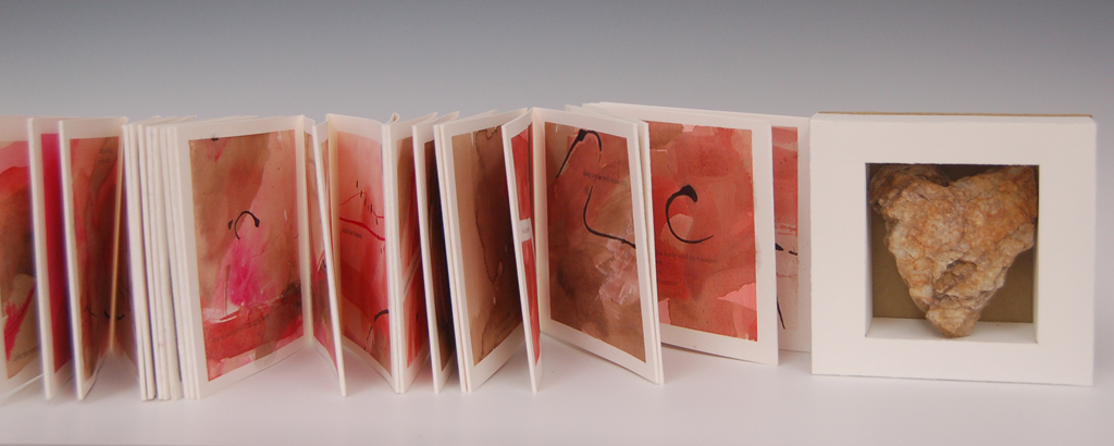 Ten Ounces is a collaboration between artist Melanie Mowinski and poet Zack Finch. It began as a conversation about the vessels that lead to and from the heart. It evolved into a poem and an artist book that explores the tension between the importance and impossibility of letting go: especially when faced with a unexpected medical diagnosis or other life challenge. After Finch viewed the painted pages, he edited his poem to 42-lines, the same number of lines in the book.
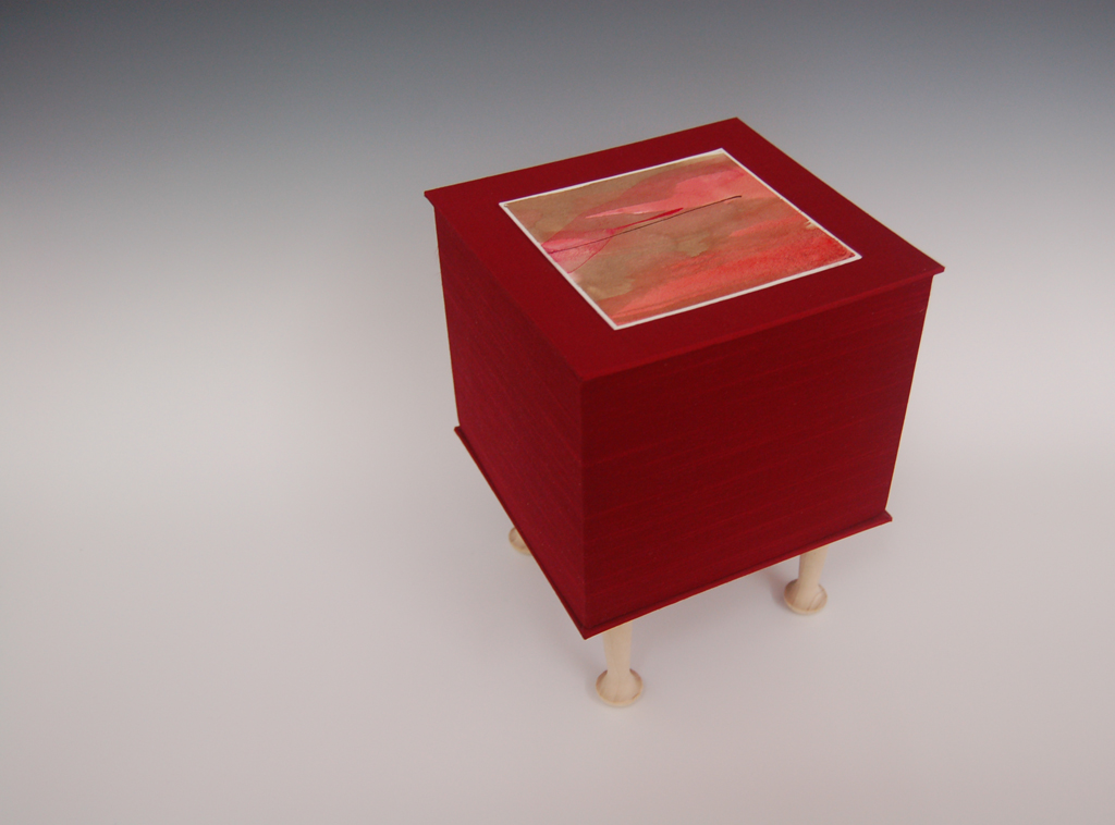
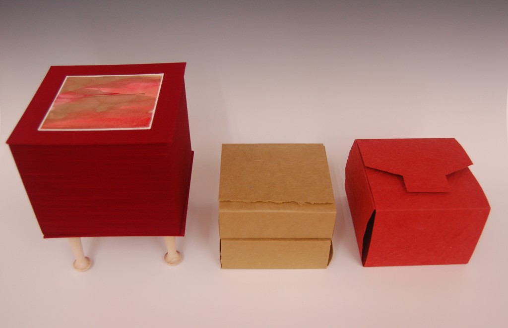
To get to the book, the viewer must lift off the top section of the shrine-like box, 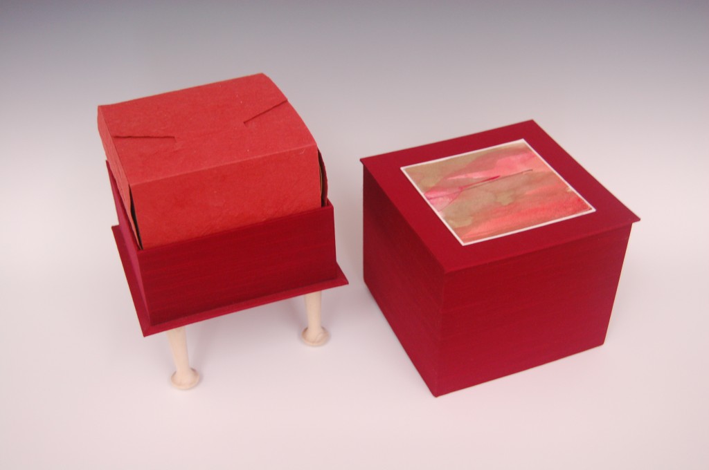 revealing first one wrapped vessel, which once removed reveals two more wrapped vessels. The two remaining vessels are the 210 inch book and a stone heart. The book is meant to be read while contemplating the heart.
Mowinski used the mysterious and atmospheric quality of photocopy transfer to create the text. The words and letters are very linear, and wind through the more organic and fluid imagery on the pages. This contrast is the heart.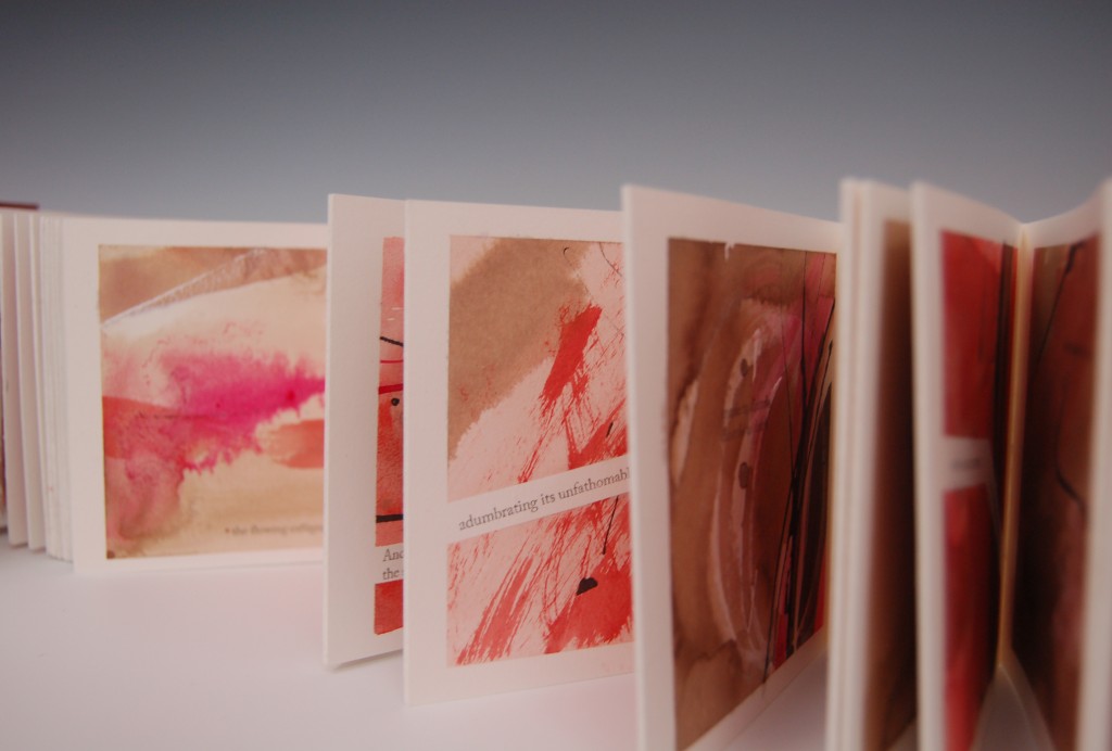
Artist Note: This is my submission for the Guild of Book Workers 2015-2017 Traveling Exhibition Show. The deadline is midnight, March 1, which I made by an hour or so. I will follow-up this entry with another one that discusses how I made the box, and what I learned through that process.

5 Comments
Wonderful and amazing just like you! Congrats on making that deadline! The colors are passionate, grounding & corporeal. You know how much I love shrines. Bon Courage! Karen
Thanks for describing the process. It really helps me see more, and understand what I’m looking at. I’d like to open this box myself one day.
Holly–if you take a look at this page, you’ll see how I make the words. The string is sandwiched in between two layers of paper pulp.
Wonderful to read about. Congratulations on a fabulous collaboration.
[…] one page books. So I’m also playing with imposition. Very fun. I may use this to edition my Ten Ounces book. We shall […]