Parallel is the result of a  collaboration with Marianne R. Petit. Marianne lives in Shanghai, China, I live in Cheshire, MA, USA. So our collaboration needed to be virtual. We each posted a picture to a tumblr site everyday from March 2-27, 2014. Each picture was to be in response to something that the other posted. As we began the blog, we also began to craft our own individual artist books. Books that would in the end derive inspiration from the Tumblr page.
Initially, we utilized Julie Chen and Barbara Tetenbaum’s Artist Book Ideation Deck to get us started.
Marianne got the following cards: Text: Abstract Non-Verbal Gibberish | Color: Muted or Pastel | Image: Self-Generated | Layout: Based on a historic example | Structure: Innovative | Paper: Pretreated | Technique: Use a technique that is unfamiliar to you | Adjectives: optimistic, gigantic, whimsical, sculptural, futuristic.
I got the following cards: Text: Process or erasure | Color: Favorite | Image: Extracted from a single image| Layout: Based on a historic example | Structure: Innovative | Paper: neutral | Technique: High-tech | Adjectives: opposing/contrasting, mystical spiritual, impressionistic, complicated/confusing, formal
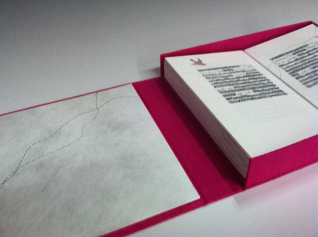
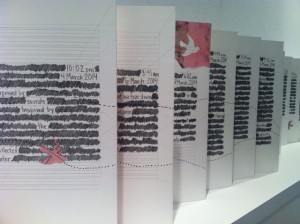
What did I make with these constraints? My book is a double-sided flagbook/accordion book (innovative)—with opposing/contrasting pages and can displayed opened to reveal all the pages.
When thinking of a historic example, I thought of one of my adjectives, mystical/spiritual and turned to the layouts of illuminated manuscripts and page layout canons from the medieval period. It’s quite a formal and somewhat complicated layout, some of my adjectives.
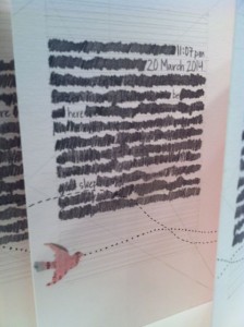
I created the text by hand-writing every single one of our blog entries. Marianne’s are on the left, mine are on the right. Once they are written, I am redacting the text through the process of “erasure” by scribbling over most words 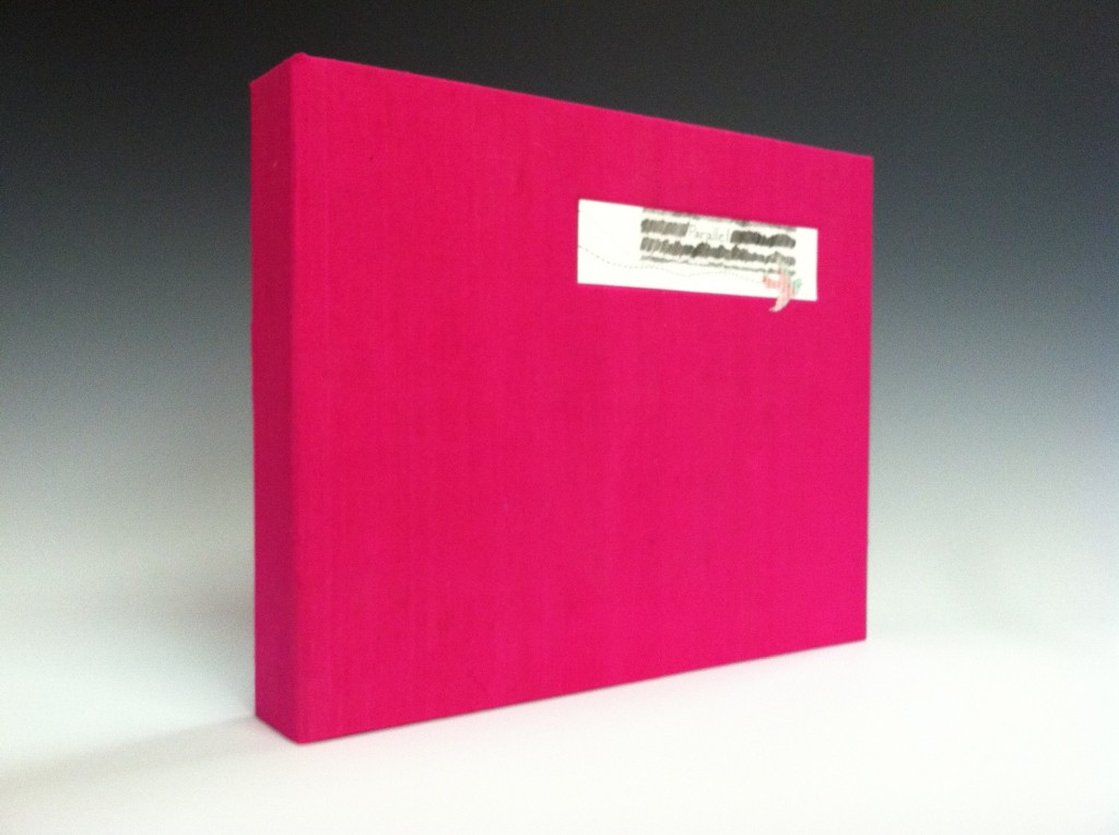 thereby revealing a new text.
My image is extracted from a bird image that I discovered earlier in the month, it moves back and forth between the two sides of the book. There are pathways and little dots that create an impressionistic sense and will hopefully confuse the reader a bit. Two more of my adjectives.
I used Crane 100% cotton paper—Marianne and I agreed to source paper locally. My paper is neutral in the sense that it is not pre-treated, printed, painted or otherwise. Of course, I did add something extra–a dyed-tyvek spine. And I used my favorite color–a bright, near fuchsia pink. More as a challenge–one of my friend’s recently commented on the fact that you don’t see pink in much art. So not only is pink part of this book, the book is housed in a pink clamshell box made from pink silk bookcloth that I made a few years ago.
My technique was supposed to be high-tech. Well, it’s high tech compared to the time of the layout. I used the Ames lettering guide to draft my text lines/layout. I also used a guillotine to trim the book and instead of glue, I used double-sided tape to adhere the pages to the spine. While none of these are considered high-tech right now, at some point they were.
Check out our tumblr site for more pics, process, etc..

